Making a dashboard with Keen IO + SendGrid's Event Webhook data
Introduction
Ever wanted to create a cool dashboard showing your outbound email event data that you can look at while drinking some coffee? :)
This is a quick tutorial on getting a dashboard setup with SendGrid's Event Webhook Data and Keen IO.
- SendGrid is an email infrastructure that lets you easily send transactional and marketing emails. They have an Event Webhook that lets you receive all events that happen with an email such as Delivered, Clicked, Marked as Spam, etc.
- Keen IO was built to collect and store huge amounts of data. You can send it data from multiple different sources and then query, visualize and analyze that information.
Storing, analyzing and displaying email event information can be useful for tracking how well your email marketing campaigns are doing, what percentage of users are going through the delivery funnel, from receiving an email all the way to clicking on a link, and making sure that you're keeping a clean email list and have a low number of Spam reports.
This tutorial is going to assume you have just created accounts for both services, and should be even easier to follow if you already have that setup. It will cover:
- Creating a free Keen IO and SendGrid account
- Connecting the SendGrid Event Webhook to Keen IO
- Grabbing Keen IO dashboards template
- Creating email metrics to display in the dashboard
Also, there'll be a gist link under every block code, if you want to check the full file for each part of the tutorial. ☺
The final result should look similar to this:

And you can find a GitHub repository with the final code here.
Setup
First things first, let's create a free account at:
- Keen IO: https://keen.io/signup
- SendGrid: https://sendgrid.com/user/signup
It should be pretty straightforward. The SendGrid free account will let you send up to 12.000 emails a month, and Keen IO will let you store 50.000 events a month.
Connecting both services
Next up, let's setup SendGrid's Event Webhook to start sending all of our email events to Keen IO.
- When you create an account at Keen IO, it automatically sets up a "My First Project" application. Copy the "Project ID" information, then click on "Show API Keys" and copy both the "Write Key" and the "Read Key".

- Next, head over to your SendGrid account, click on "Apps" in the top navbar, and make sure that you see the "Click Tracking" and "Open Tracking" apps enabled. If you don't, click on "Show Disabled Apps" and enable them.

- In the same "Show Disabled Apps" page, enable the app "Event Notification". Scroll up, click on "Show Enabled Apps", hover over the "Event Notification" app you just enabled and click on the "Settings" options for it. To save all of your events, you need to set the HTTP Post URL field to the Keen IO URL. Use the URL below, but change the variables KEEN_PROJECT_ID and API_WRITE_KEY with the information you copied earlier from Keen IO:
https://api.keen.io/3.0/projects/KEEN_PROJECT_ID/partners/sendgrid/versions/v3?api_key=API_WRITE_KEY - Finally, go ahead and in the same page, under "Select Actions" check the box that says "All" so we can gather all email events.
(If you need more help on this step, ping me or check out this link: https://keen.io/docs/partners/#sendgrid)
Awesome! With this setup, now we just have to send an email with SendGrid so we can see that information inside Keen IO. Let's try it out by sending a test email using our terminal and cURL. Like with the URL above, just change the variables YOUR_EMAIL, YOUR_SENDGRID_USERNAME and YOUR_SENDGRID_PASSWORD:
$ curl -d 'to=YOUR_EMAIL&toname=YouAreAwesome&subject=Awesome Subject&text=awesomebody&from=info@domain.com&api_user=YOUR_SENDGRID_USERNAME&api_key=YOUR_SENDGRID_PASSWORD' https://api.sendgrid.com/api/mail.send.json If we go back to our Keen IO project dashboard, in Overview we can check the "Event Explorer", select the "Sendgrid Email Events" from the drop-down list and then click on the Last 10 Events button. This should show at least one of our delivered email events, or more if you went to your inbox and opened it. ☺
Grab the dashboard templates
Okay, so with that, let's get our dashboard setup! Keen IO has a pretty cool repository on GitHub with a set of responsive (Bootstrap) dashboards we can use. Let's grab it and go to the hero-thirds template layout:
$ git clone https://github.com/keen/dashboards.git $ cd dashboards/layouts/hero-thirds The hero-thirds template folder only has two files, index.html and preview.png. Open index.html in your favorite text editor and scroll down to the bottom.
Creating and displaying email metrics
At the bottom of index.html, you will see some script tags. We'll add our own script right at the bottom of the page, but before the closing body tag. The first thing we have to do is initialize a Keen object instance of their JavaScript library by doing:
// index.html // ... above you'll find the script tags and the rest of the html // this is the last script tag <script type="text/javascript" src="../../assets/js/meta.js"></script> // here we add our code to create a new instance of Keen <script> var client = new Keen({ projectId: "YOUR_PROJECT_ID", readKey: "YOUR_PROJECT_READ_KEY" }); </script> </body> Now to the really fun part! Let's use Keen to analyze the event data we got from SendGrid and put some useful information on our dashboard. (Keen's dashboard project has a sample on how to analyze data using their JavaScript SDK inside demo-data/sample.html)
Let's first put up a bar chart in our dashboard showing all the events as separate columns, with a daily interval for the past 30 days. Inside the script tag where we created our Keen object, add the following lines:
// index.html <script> var client = new Keen({ projectId: "YOUR_PROJECT_ID", readKey: "YOUR_PROJECT_READ_KEY" }); // query all events for the past 30 days, with a daily interval Keen.ready(function() { var daily_send_static = new Keen.Query("count", { eventCollection: "Sendgrid Email Events", groupBy: "event", timeframe: "this_30_days", interval: "daily" }); // and draw a column chart client.draw(daily_send_static, document.getElementById("daily-send-30-days"), { chartType: "columnchart", title: false, height: 250, width: "auto", chartOptions: { chartOptions: { isStacked: true } } }); }); </script> All our queries and draw calls will be inside the Keen.ready function callback. For each query we want to make, we create a variable ("daily_send_static" in this case) and then we call client.draw with the same variable as the first parameter (the query that will be executed). Next define which html element in our page will hold the chart. In this case, we're using the element ID "daily-send-30-days", so let's scroll up our index.html file and set that ID for the first element:
<div class="container-fluid"> <div class="row"> <div class="col-sm-8"> <div class="chart-wrapper"> <div class="chart-title"> Last 30 Days Events </div> <div class="chart-stage" id="daily-send-30-days"> </div> <div class="chart-notes"> Notes about this chart </div> </div> </div> We change the title of our chart from "Cell Title" to "Last 30 Days Events", remove the <img data-src="holder.js/100%x240/white/text:#grid-1–1"> placeholder, and add the id "daily-send-30-days" to our div so Keen knows where to draw our column chart.
Now just open index.html in your browser and you should be able to see this:

Awesome! Okay, it's not super impressive, but as we get more data sent from SendGrid over the next days, our chart will look even better. ☺
Let's set up something a little bit more complicated: an email delivery funnel. We will be able to check a chart showing how many people received the email, opened, read and finally clicked on any link inside. Just like the first query, let's scroll down to the bottom and add some code inside the Keen.ready block (this is a big chunk):
// ... just under the client.draw call we added before, let's add the following // query and draw a barchart // activation funnel, from delivered to opened to read to clicked var watch_activation_funnel = new Keen.Query("funnel", { steps: [ { event_collection: "Sendgrid Email Events", actor_property: "sg_message_id", filters: [ { "property_name" : "event", "operator" : "eq", "property_value" : "delivered" } ], timeframe: "last_30_days" }, { event_collection: "Sendgrid Email Events", actor_property: "sg_message_id", filters: [ { "property_name" : "event", "operator" : "eq", "property_value" : "open" } ], timeframe: "last_30_days" }, { event_collection: "Sendgrid Email Events", actor_property: "sg_message_id", filters: [ { "property_name" : "event", "operator" : "in", "property_value" : ["open", "click", "unsubscribe", "spam"] } ], timeframe: "last_30_days" }, { event_collection: "Sendgrid Email Events", actor_property: "sg_message_id", filters: [ { "property_name" : "event", "operator" : "eq", "property_value" : "click" } ], timeframe: "last_30_days" } ] }); client.draw(watch_activation_funnel, document.getElementById("delivery-funnel"), { library: "google", chartType: "barchart", height: 250, title: null, colors: ["#79CDCD"], labels: [ "Delivered", "Opened", "Read", "Clicked" ], chartOptions: { chartArea: { height: "85%", left: "20%", top: "5%" }, legend: { position: "none" } } }); For this query, we specify the type to be "Funnel", which means we can set an array of steps and analyze our data with different filters for each step. The steps are pretty straightforward, but you can see that in the third step, which we use to track if the user has read an email, instead of looking for an event property that equals to a set value like the others, we set an array of options that we can use to consider the read action to be true. ☺
And just like last time, let's add an element in our HTML with the ID we passed for Keen to draw our fancy funnel. Scroll up the file, and just below the div with our first chart:
<div class="col-sm-4"> <div class="chart-wrapper"> <div class="chart-title"> Email Delivery Funnel </div> <div class="chart-stage" id="delivery-funnel"> </div> <div class="chart-notes"> Notes about this chart </div> </div> </div> Just change our chart title to "Email Delivery Funnel", remove the image placeholder and add the id "delivery-funnel". Refresh index.html in your browser and… :
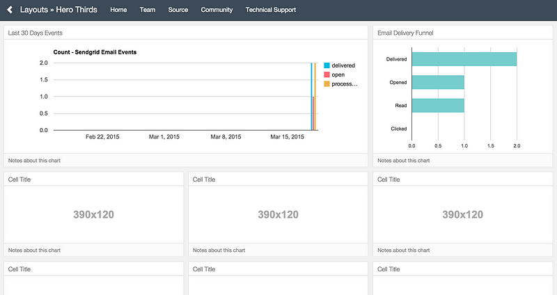
If the image above looks a little bit different than yours, try going to your inbox and opening the test email we sent at the beginning of this tutorial and then refreshing the page.
Next up, let's add more information to our dashboard. I'm going to paste the code to make a Keen query that will count the number of emails sent all-time (starting when we integrated with Keen IO), the number of spam reports for the last 30 days, and a pie chart comparing the number of emails delivered to the number of emails opened:
// query and draw a metric (a number + text) // all-time emails sent var count = new Keen.Query("count", { eventCollection: "Sendgrid Email Events", filters: [ { "property_name" : "event", "operator" : "eq", "property_value" : "delivered" } ], }); client.draw(count, document.getElementById("all-time-emails-sent"), { chartType: "metric", title: "All-time Emails Sent", colors: ["#49c5b1"], }); // query and draw a metric (a number + text) // spam events for the past 30 days var count_spam_monthly = new Keen.Query("count", { eventCollection: "Sendgrid Email Events", filters: [ { "property_name" : "event", "operator" : "eq", "property_value" : "spam" } ], timeframe: "last_30_days", }); client.draw(count_spam_monthly, document.getElementById("spam_monthly_count"), { chartType: "metric", title: "Monthly Spam Reports", colors: ["#fe6672"], }); // query and draw a piechart // get open events and delivered events, then execute both queries at the same time var openMetric = new Keen.Query("count", { eventCollection: "Sendgrid Email Events", targetProperty: "event", filters: [ { "property_name" : "event", "operator" : "in", "property_value" : ["open", "click", "unsubscribe", "spam"] } ] }); var deliveredMetric = new Keen.Query("count", { eventCollection: "Sendgrid Email Events", targetProperty: "event", filters: [ { "property_name" : "event", "operator" : "eq", "property_value" : "delivered" } ] }); var chart = new Keen.Dataviz() .el(document.getElementById("opened-email-conversion")) .chartType("piechart") .title("Conversion %") .prepare(); // start spinner // Send queries to Keen IO var mashup = client.run([openMetric, deliveredMetric], function(err, res){ if (err) { // Display the API error chart.error(err.message); } else { var openMetricResults = res[0].result // data from first query var deliveredMetricResults = res[1].result // data from second query var data = [] // place for combined results data[0]= // format the data so it can be charted [ { category: "Opened — Delivered", result: deliveredMetricResults — openMetricResults }, ] data[1]=// format the data so it can be charted [ { category: "Delivered", result: deliveredMetricResults }, ] chart .parseRawData({ result: data }) .render(); } }); Now you should already know what to do next to get this new data in our dashboard. ☺
Next steps
This is a quick & easy way to get setup with your own custom dashboard for email events. Each company will probably want to have its own custom set of metrics, and you can do a lot more by checking Keen's documentation, the data analysis API and the data visualization API. You can also add more information to your emails events using SendGrid's X-SMTPAPI. For example, you can add a category to all your events regarding purchases, and use that data to make more in-depth analysis inside Keen IO.
Here you can find a GitHub repository with the final code.
Now go ahead and put that dashboard in your office 60'' screen for everyone to see! ☺
Отправлено с iPad
Комментариев нет:
Отправить комментарий